
Excel Portfolio
This page demonstrates my ability to create high-quality charts using Excel 2010. The charts include bubble charts, countour maps, and pie charts.
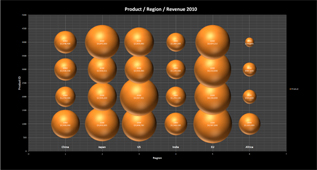
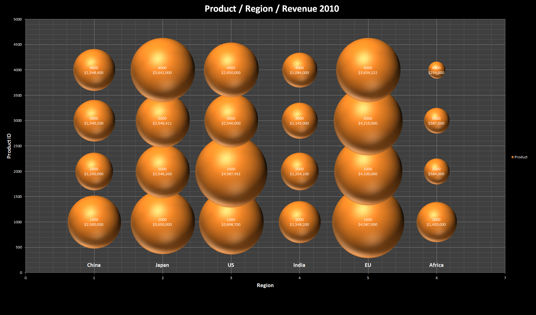
Bubble Chart
Excel File: Bubble Chart and Secondary Axis.xlsx Bubble Chart1: Bubble_Hypothetical1.jpg Bubble Chart on US Population by States: Bubble_State Population.jpg
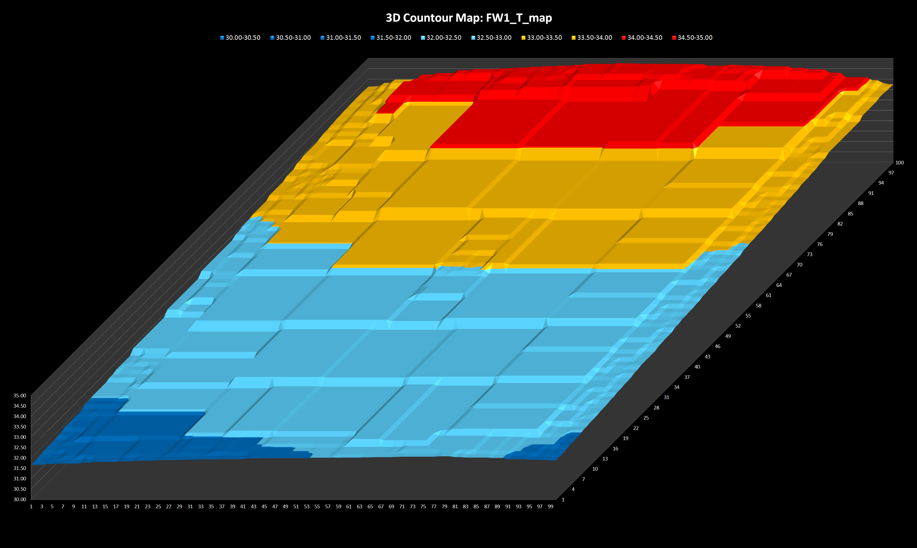
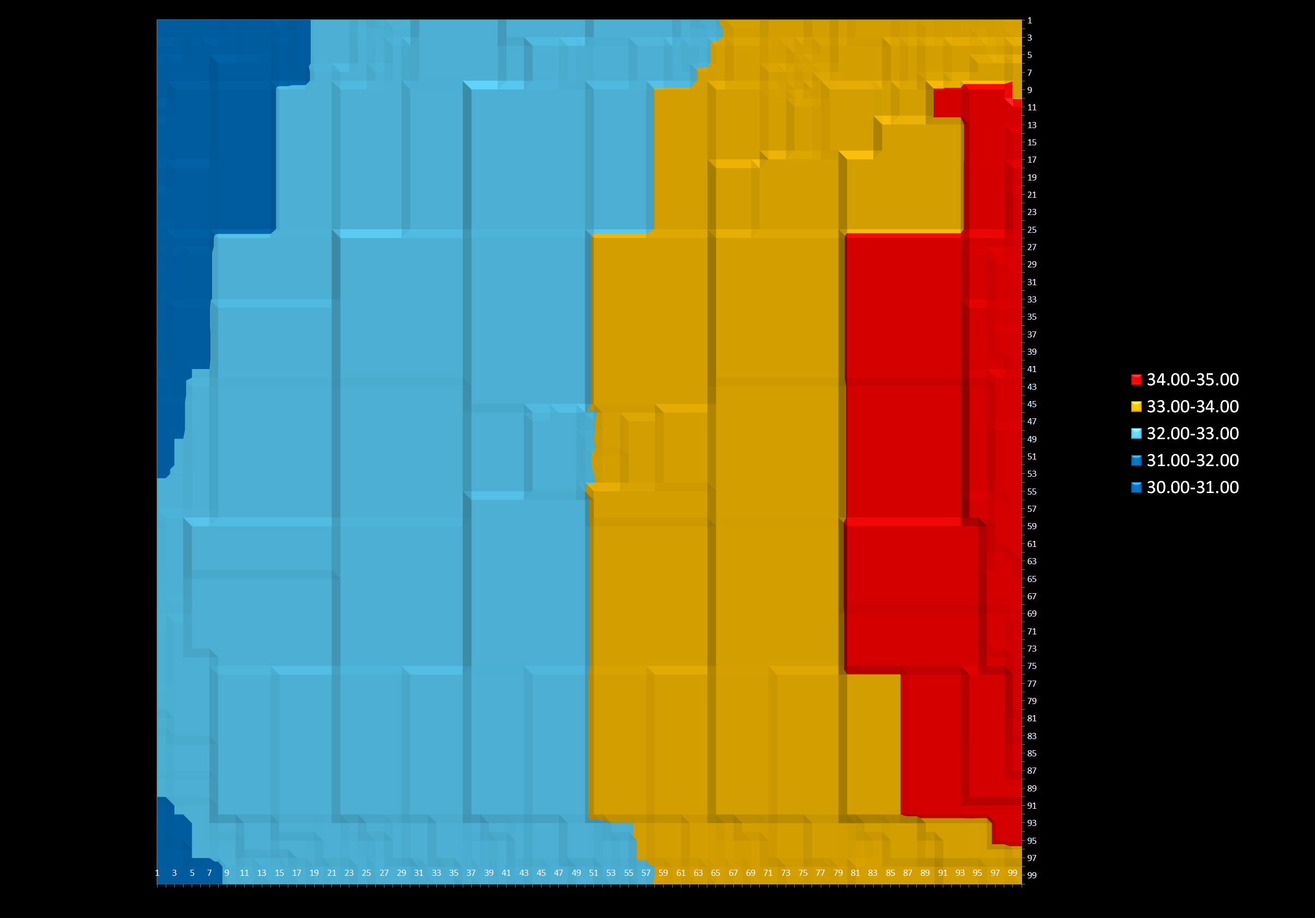
Countour Map
Excel File: Countour map.xlsx Countour Map 3D: Countour3d.jpg Countour Map Top View: Countour Top.jpg
Pie Chart
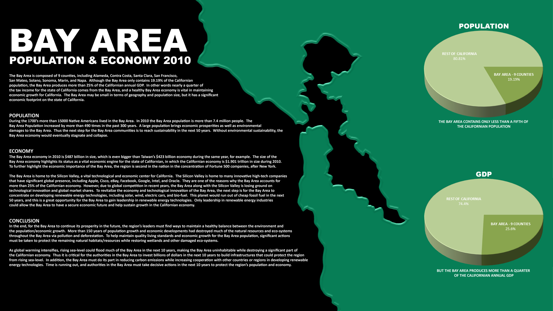
Pie Chart inserted into an image: Population_Economics_BayArea.jpg Pie Chart source Excel file: Map data.xlsx Pie Chart source data: Data Source.docx